No items found in your cart!
No items found in your cart!
 you definitely can not afford to miss this. READ HERE https://www.hub.goglowonline.com/view-post.php?post_id=67, Thanks for always taking out time to read through our blog posts @ Goglow Hub! We are Happy that you enjoy it!&image=<img src='https://www.hub.goglowonline.com/upload/1760349946goglow hub dashboard.png'/>) |
|
|
|
|
|
|
|
A Step-by-Step Guide
In today’s world, data is the new oil—but raw data is only useful if you can understand and present it. That’s where dashboards come in. An Excel dashboard is a visual representation of your data that helps you analyze, track, and make informed decisions at a glance.
The good news? You don’t need to be a data scientist to create one. With some practice, anyone can build a simple yet powerful dashboard in Excel. In this guide, I’ll walk you through the process step by step.
Step 1: Understand the Purpose of Your Dashboard
Before diving into Excel, ask yourself:
What do I want to track? (e.g., sales, expenses, student performance)
Who will use this dashboard? (yourself, a team, management)
What decisions should this dashboard help make?
Example: If you run a training center, your dashboard could track student registrations, income, and monthly expenses.
Step 2: Prepare Your Data
Your dashboard is only as good as your data. To make it work:
1. Collect your raw data (from Excel sheets, databases, or reports).
2. Organize it into a clean table with proper column headers.
3. Avoid merged cells and blank rows—Excel hates them for analysis.
Example:
| Date | Category | Amount | Type |
|---|---|---|---|
| 17-sept-2025 | Sales | 15000 | Income |
| 18-sept-2025 | Marketing | 5000 | Expenses |
| 19-sept-2025 | Rent | 8000 | Expenses |
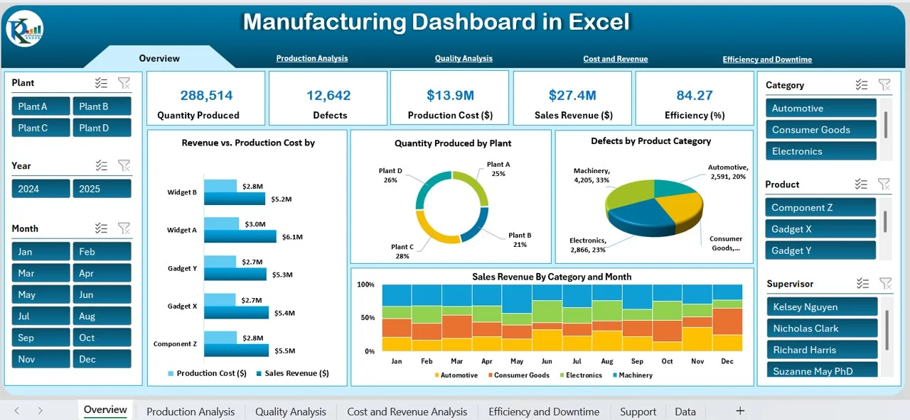
Step 3: Insert a Pivot Table
Pivot Tables are the backbone of dashboards. They allow you to summarize, group, and filter data quickly.
1. Select your dataset.
2. Go to Insert → Pivot Table.
3. Choose a new worksheet.
4. Drag and drop fields into Rows, Columns, and Values to create summaries.
Example:
Rows → Category
Values → Amount (Sum)
Filters → Type
This will instantly give you a breakdown of income and expenses.
Step 4: Add Charts for Visualization
Numbers are good, but charts make data easy to understand.
1. Click on your Pivot Table.
2. Go to Insert → Recommended Charts.
3. Pick chart types that make sense:
Column Chart → Compare categories
Line Chart → Track trends over time
Pie Chart → Show proportions
Tip: Don’t overload your dashboard with too many chart types. Stick to 2–3 clear visuals.
Step 5: Add Slicers and Timelines
To make your dashboard interactive, use slicers.
Slicer → Lets you filter data with one click (like buttons).
Timeline → Filters data by dates.
Steps:
1. Select your Pivot Table.
2. Go to Insert → Slicer.
3. Choose fields (e.g., Type or Category).
4. Resize and format slicers for a professional look.
Now, your users can click on “Income” or “Expense” to instantly filter the charts.
Step 6: Design Your Dashboard Layout
This is where you bring everything together.
Place charts, Pivot Tables, and slicers neatly on one sheet.
Use consistent colors (avoid too many bright ones).
Add a clear title and labels so viewers know what they’re looking at.
Remove gridlines for a clean look: View → Untick Gridlines.
Example Layout:
Top → Title (“Business Performance Dashboard”)
Left → Slicers (filters)
Center → Main charts (Income vs. Expense)
Bottom → Table with key numbers.
Step 7: Add KPIs (Key Performance Indicators)
A good dashboard highlights what really matters. You can add simple KPI boxes:
Total Income → Use =SUMIF() or Pivot Table totals.
Total Expenses → Same method.
Net Profit → Income – Expenses.
Format them in bold, larger fonts, or with conditional formatting (green for positive, red for negative).
Step 8: Test and Finalize
Before sharing your dashboard:
Check if slicers and filters work properly.
Ensure charts update automatically when new data is added.
Save a copy as a template for future projects.
Benefits of an Excel Dashboard
Saves time (no need to analyze raw data repeatedly).
Makes decisions faster with visual insights.
Easy to update and customize.
No extra software—just Excel!
Final Thoughts
Creating a dashboard in Excel may seem challenging at first, but once you understand Pivot Tables, Charts, and Slicers, it becomes a game-changer. Start with a simple project, and as you get better, you can build professional dashboards that look like what big companies use.
At Goglow Hub, we teach practical Excel skills, including data analysis and dashboard creation, so you can apply them to real-life business, career, or personal projects.
👉 Want to learn more? Contact us at 08147561478, WhatsApp 08074002374, or visit hub.goglowonline.com to join our training.


![]() Courses
Courses
 Graphics Design
 Web Development
 Mobile App Development
 System Application Development
 Computer Appreciation
 Architectural Design
 UI/UX Design
 Programming
 Software Development
 Computer Repairs
 Solar Panel Installation
 CCTV Installation
 Digital Photograpghy
 Digital Marketing
 Data Analytics
 Database Management
 Ethical Hacking
 Blockchain Development
 Jamb CBT Practice
 TOEFL Training
 IELTS Training